WordPress 5.8 is scheduled to be released on July 20, 2021 and one of the new features slated for this release is an update to the way widgets work.
There’s a “call for testing” up on one of the WordPress community blogs. This post covers my experience running through this test. Its important to note that I didn’t actually complete the entire test. I spent just about 90 minutes and never got to test the Customizer updates.
I have a few testing sites setup on my machine using Local, a very handy app that makes it super simple to manage multiple WordPress sites. I made sure I was using the correct versions of both WordPress (5.7.1) and Gutenberg (10.6) and dove into the instructions.
The test specifies installing a plugin that enables widgets. The first one that came to mind was Astra. So, I headed to “Add New” under Plugins and searched for Astra. From the results I clicked “Install Now” and, after a few seconds, I clicked the new Activate button.
Turns out I already had a few widgets setup in my site’s Footer, so I adjusted some of those and then added one of the Astra widgets. I randomly picked the “Astra: Address” widget and was shocked at how terrible the UI was and generally how limiting the widget’s output was. There are inputs and checkbox for all sorts of things, but the output was very anti-climatic for the work required. It would be way easier to accomplish the same thing with some blocks instead.

For instance, in the above screenshot you can see the Astra Address Widget. The icons are kind of nice, but I have no way to get rid of the horrible italicizing of the text. If that was a block, I could just select the text and untoggle the italic button in the toolbar.
And here’s what those same widgets look like when editing from the “legacy” screen…

Ugh. Look at that mess. Its obvious this screen hasn’t changed in years.
Now we’re getting to the fun stuff; The next step of the test is to activate the Gutenberg plugin and enable the widgets experiement. Once I did that, I ventured back to “Appearance > Widgets” and found myself looking at this screen…

Ok, well. My first reaction is that this looks a little nicer. There’s more focus, and it seems like its trying to mimic the design of my website. However, there’s a number of bugs and strange things happening here.
First, the widget area names and toggle buttons are a lot of excess space that seems unintentional. Clicking the toggle button causes a strange shift on the screen; This seems like a few releated bugs, perhaps some CSS “bleed” from the Twenty Twenty theme.

Selecting the first widget area highlights it with a blue outline and I see a block toolbar. Unfortunately, this toolbar is obscured by the editor’s top bar, making it mostly unusable.

When the widget area toolbar is visisble, there’s some spacing issues around the block icon; In the image below you can see the different spacing on the left and right of the icon.

The block toolbar for the widget areas (which I assume are actually blocks themselves) seems mostly useless. The icon is the generic block icon, which doesn’t really convey any helpful information and is not interactive. The ellipsis “more” menu contains few options, and doesn’t seem very relevant to working with widgets.
The toolbar for blocks within a widget area is misaligned. It appears to be indented for some unknown reason. I believe this is caused by the parent selector button that normally appears when a block is nested.

One area the testing instructions specific mention is moving blocks. I found that I was able to move blocks — either with the move buttons or with drag-and-drop — within their current widget area, but I was unable to do the same between widget areas. This feels like a regression, as the “legacy” screen makes moving widgets very easy.
I did discover this “Move to” button in the toolbar of blocks…

…but it seems more like a bandaid than a solution. This is especially confusing when I also see the “Move to…” option that exists in the ellipsis menu.

I started playing with the widgets I had, customizing some of their information, and adding new widgets and blocks.
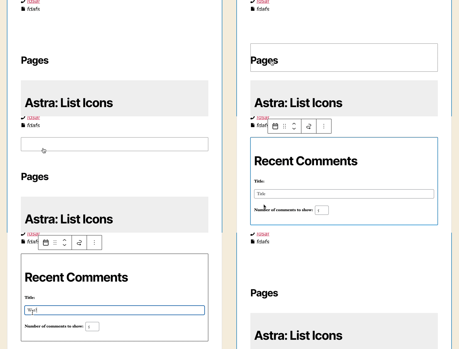
There’s some confusing things that happens with the height of widgets, in my case, the height of the Astra Address widget when deselected was too short and cut off much of the content.

Its easy to wind up with a “ghost” widget; That is, a widget that definitely exists but you don’t see it until you hover or click on it.

At some point I discover that some — but not all — of my widgets had this curious circular arrow icon (which doesn’t fit with the rest of the icons stylistically) that says it allows me to “Change widget.”

Ok. Change it to what? I clicked on it and found myself looking at this…

The layout of this is a little messy, but it also doesn’t really contain any helpful messaging. The best I can figure, this allows me to swap one widget for another. To be honest though, I’m not entirely sure why I’d want to do that…
This whole sidebar seems very empty and useless.

Whew. Ok. I’ve been going through this for 90 minutes so far, and I haven’t even touched the customizer yet. I’m going to stop here for now and post what I’ve found.
Leave a Reply to Design Team Meeting Notes May 20, 2021 – Make WordPress Design Cancel reply